HJ INTERIORS
HOME IS WHERE THE HEART IS
Sally and Jamie Brooks share the process of their salon relocation and discuss their business ethos
KEY FACTS
Name: Brooks & Brooks
Address: 28 Great Queen St, London WC2B 5BB
Owners: Sally and Jamie Brooks
Size: 3,500 sq ft
How long have you been in the premises: from June 2023
How many staff: 50
Budget: £250,000
Sally and Jamie Brooks opened their first salon, Brooks & Brooks, 21 years ago in Holborn, London, but due to a redevelopment project in the area, they were recently forced to search for a new home. After struggling to find the right space, the stars aligned as they discovered Charles Worthington was retiring; together they came to an agreement, to take over the lease – and take on the majority of the existing team, too.
Although Charles Worthington had been operating as a fully functional salon, Sally and Jamie felt that a complete overhaul was needed, which would allow them to update the space while also making their own mark. However, as a Grade 2* listed building, this required some careful consideration.
The desire to create a home was the driving force behind many of the design decisions, with Jamie noting: “We wanted to create a space where our clients and our team can relax in a contemporary setting.” This was something the project’s designer, Roger Smith, had a clear grasp on, having worked with the duo on their previous salon and therefore understanding their ethos.

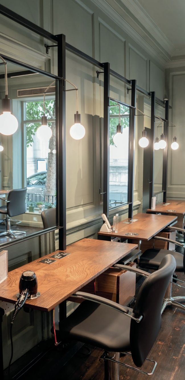
Guests are welcomed into the reception with muted tones of grey paired with warm mustard and natural woods; it’s designed to feel both refreshing and cosy, acting as the hub of the salon. A particular client favourite is the conservatory, which hosts a bespoke colour bar with a stainless-steel worktop, highlighted by the natural light which envelops the space. While lighting is at the forefront of every salon owner’s mind, the building’s listed status presented Sally and Jamie with a unique challenge; as an appropriate workaround, everything is suspended from beautiful black metal work creating a visual that is both practical and stunning.

Meanwhile, the suspended metal workstations are designed for both the client and the team, including plug sockets for clients and easily accessible sockets for the hairdresser. There is a dedicated space for stylists to store their kitbag, while each section has a trolley that perfectly fits into the unit, so that there are no trolleys parked in odd places in the salon. It’s a simple, minimalistic design that works across the whole salon.
“The salon really is a home – it's the home of the hair art ists – where each detail is considered. It has points of interest in every corner...”
Reinforcing his vision for the salon, Jamie shares: “We wanted it to be slick and inviting but not corporate.” To balance out the neutral colour palette and bring life into the space, books and magazines are scattered on shelves, in what is another nod to the concept of 'the home'. Jamie notes: “The salon really is a home – it’s the home of the hair artists – where each detail is considered. It has points of interest in every corner that the client sees, feels and talks about but at the same time gives the team a relaxed, uncomplicated way of working.”
SALLY AND JAMIE’S TOP TIPS
1 Keep value for money front of mind
If you’re looking to spend £10k on a music system, is that going to compromise what you can spend on client comfort?
2 Create Something that is timeless
Don’t be too of-the-moment, it still needs to look great in five years’ time.
3 Stick to your value
Focus on what matters most to you, rather than go crazy on fluff and puff.